
A Greyhound,
shaped by speed
A brand built from zero. 89 web pages. 500 custom bikes across 42 countries. A 73-page identity system. An 18-page customer journey document. 4,000+ photos published. One studio. Seven years of unconditional commitment.
Every system built, every race photographed, every bike designed — by the same hand, the whole way through.
A disruptive bike brand that needed
a visual world to match its ambition
Kú Cycle was born from the collision of two exceptional careers: a Formula 1 engineer who had worked with Ferrari and Benetton, and a Dutch entrepreneur who had built the world's most successful professional triathlon team. Together, they set out to design the triathlon bike that would change the sport — one engineered precisely around the rider's geometry, where an industry-standard frame would simply not do.
The studio joined from the very beginning — before the first logo, before the first bike, before the first client. What followed was seven years building a brand, a platform, a production system, and a visual archive from zero.
The studio came in as a long-term creative partner, helping build the entire visual ecosystem: brand identity, digital platform, photography, product documents, technology branding, and the customer journey system.

The full
scope
- 100%Logo system — full mark, logotype, abbreviated
- 100%Visual identity manual (73 pages)
- 100%Brand book
- 100%Kú Racing sub-brand system
- 100%Colour, typography, pattern systems
- 100%Technology branding (FAST · HAS · SPB)
- 100%Sponsor version — bike + suit coordination
- 100%Web design — 89 pages, full architecture
- 80%Web programming & build
- 100%All web graphics, illustrations & 3D
- 100%Google Assets — Analytics, Maps, Business
- 100%Google Adwords campaigns
- 100%Store — 88 products photographed
- 100%91 NextGen + 7 Kú Racing profiles
- 100%29 blog posts · 44 galleries published
- 100%Product photography — TF1 studio
- 100%Store photography — 88 products
- 90%Web image library — main banners
- 70%Event photography — races & tests
- 100%User manual photography
- 100%Photo editing & retouching
- —44 galleries · 4,000+ photos published
- 100%CPO system design & programming
- 100%500 customer bike designs executed
- 100%1,500+ designs presented to clients
- 100%TF1 User Manual — 34 pages
- 90%3D visualisations — web & CPO
- 100%Apparel design — standard & sponsor
- 85%Social network campaign design
- 100%Editorial campaign design
- 100%Presentation design
- 100%Video compression & processing
- 100%Video & sound edition
- 100%Video graphics edition
- —Server management & security
- —IP blocking & blacklist management
- —Blog & email list systems
- —Social network setup
- —Google Identity setup
- —Athlete profile cards — Kú Racing
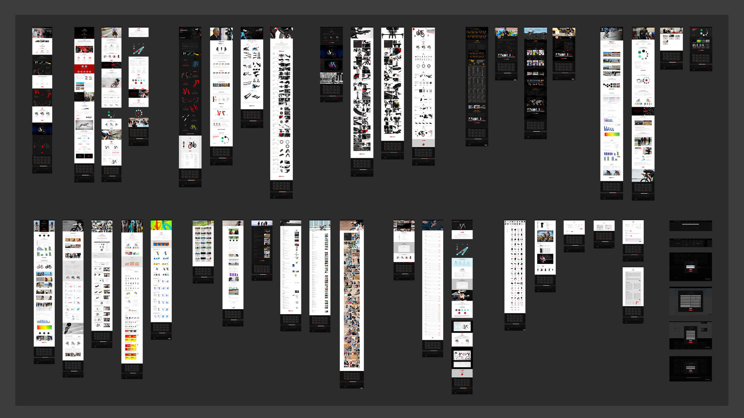
89-page website — full screen capture map — www.ku-cycle.com
A mark built for speed
and for the long run
The Kú Cycle symbol is a greyhound in motion — a creature defined by efficiency, aerodynamics, and the pursuit of pure speed. The choice was deliberate: an animal that speaks purely to velocity and belongs to no cycling cliché. It embodies exactly what the brand believes about performance: that the perfect body-machine relationship is where victories are made.
The custom logotype was designed to read as both high-technology and athletic — with modified letterforms that echo the bike's aerodynamic geometry. The red accent on the Ú is the only colour in the primary system.
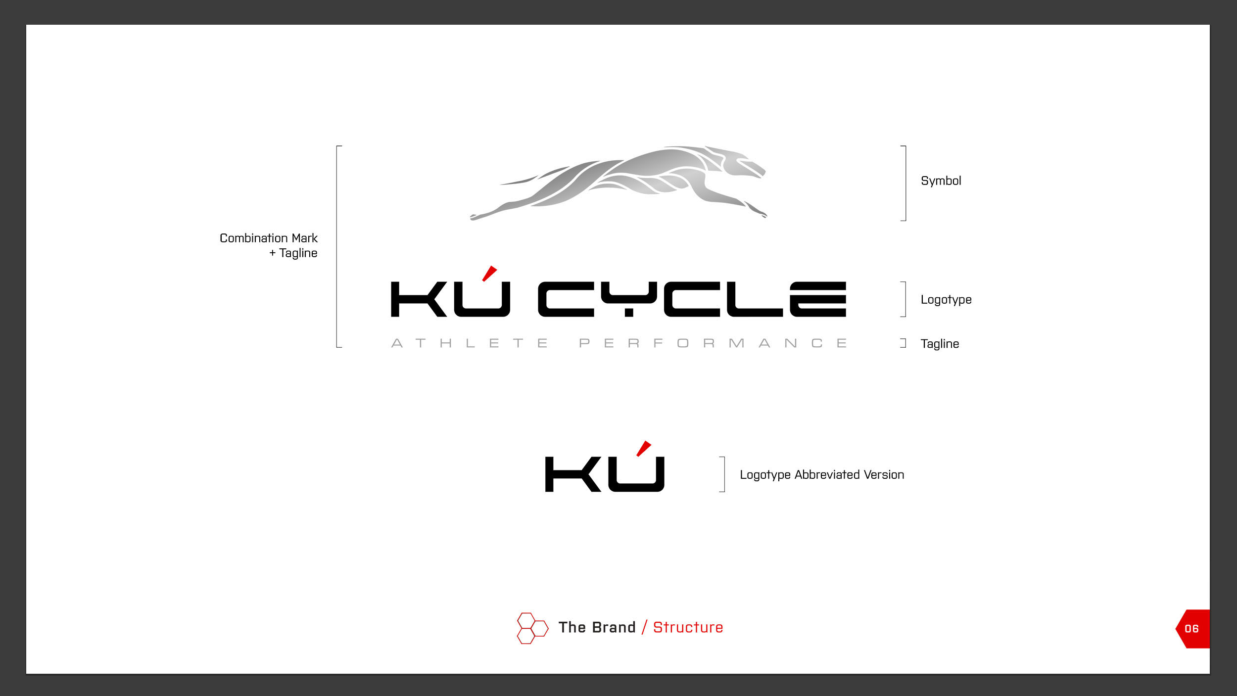
Visual Identity Manual — brand structure
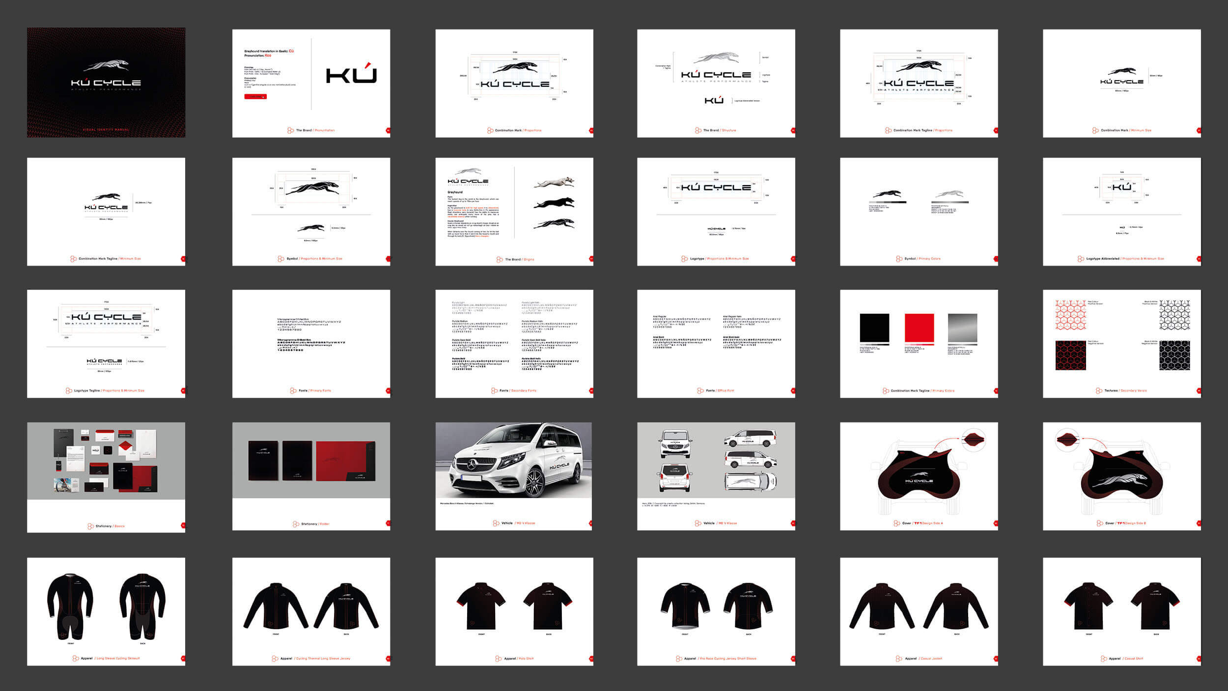
73-page manual — full contact sheet
Page Visual Identity Manual
Every logo version, colour, pattern, and application rule — from symbol to physical object.
Mark Variations
Combination mark · Logotype · Abbreviated KÚ — each documented across all contexts.
Application Chapters
Logo system · Colour & type · Patterns · Bike styling · Apparel · Stationery.
Brand Books
Kú Cycle + Kú Racing — strategy, mission, values, biography, offer.

Stationery system

TF1 Racing — CPO 3D design
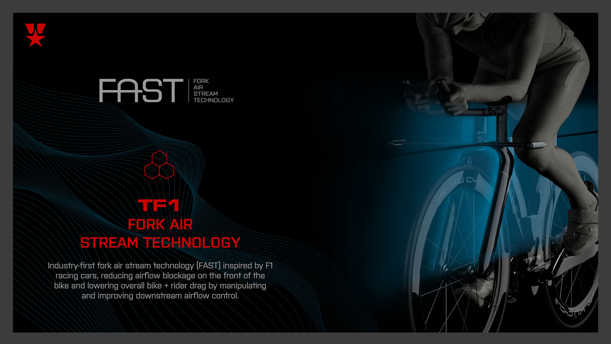
Fork Air Stream Technology
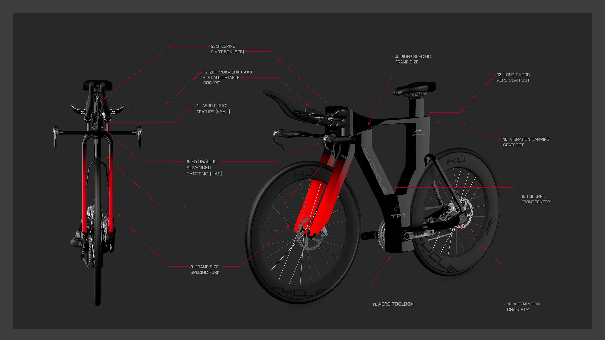
TF1 — technical feature diagram
Every bike's production
Starts and ends here
500 bikes have been produced through a single document: the CPO — Customer Production Order. Eighteen pages, fully interactive. The complete journey of every Kú Cycle client, from first fitting to paint shop.
Every decision the client makes — geometry, components, colours, finish, custom decals — is captured, specified, and transmitted through this single document.

A sample of 500 — every bike custom-configured through the CPO — ku-cycle showcase
Athlete
Name, flag, experience level, current bike, anthropometric data.
Fitting
Stack, reach, saddle height.
Components
Wheels, cockpit, saddle, drivetrain. Every component selected and specified.
Design
Brief, 3D renders, revisions, approval. Back and forth between studio and client until the design is exactly right.
The Paint Scheme
RAL codes, decal positions, component views, finish specs. The technical translation of design into production instruction.
Delivery
The signed CPO goes to the paint shop. Executed to the studio's specifications.
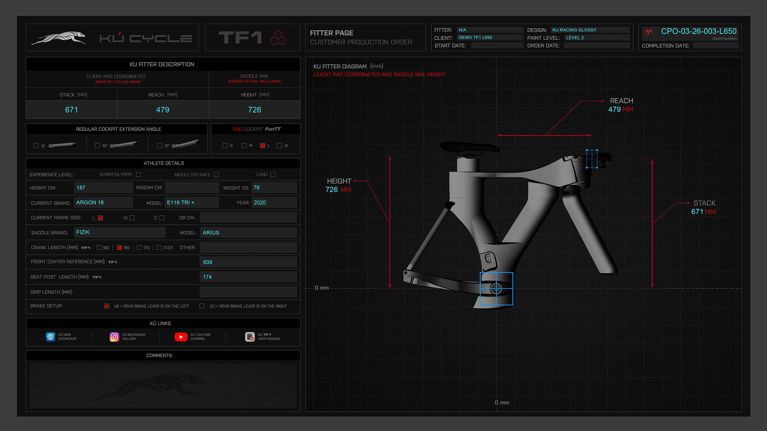
CPO — Fitter page

CPO — Paint scheme page · Frame panel

CPO — 18-page interactive PDF
The last document
every owner receives
The TF1 User Manual is a 34-page editorial and technical production: photography — on location and in studio — 3D component renders, technical assembly illustrations, torque specification tables, compatibility charts, and interactive PDF structure — a branding piece in itself.
It's the last brand touchpoint a Kú Cycle owner receives, carrying the same visual standard as the identity system.
Photography — location & studio, 3D component renders, technical assembly illustrations, torque specification tables, compatibility charts, interactive PDF with navigation.
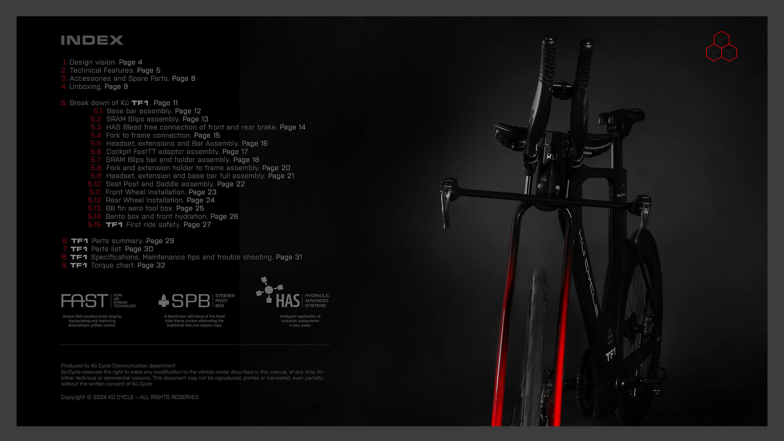


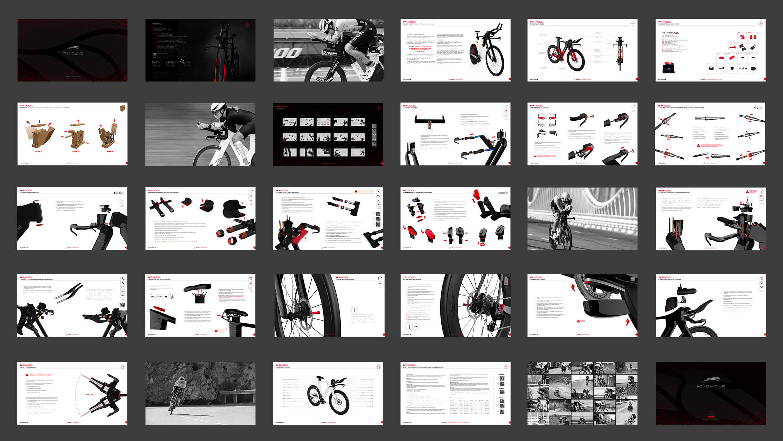
Link to the complete file — TF1 manual 2026
Naming and branding
the innovations inside the bike
Each proprietary technology developed by Kú Cycle's engineering team required its own identity — a name, a mark, and a visual language that communicates complex performance science to a competitive athlete audience.
Aerodynamic precision derived from Formula 1
The fork system engineered to manipulate airflow around the front wheel — reducing drag through precision geometry derived directly from Formula 1 aerodynamics.

Cleaner, lighter, more responsive architecture
Kú Cycle's hydraulic integration system — engineered to cut weight and friction from braking and shifting alike. The mark references hydraulic flow schematics.
The geometry engine of the TF1
The patented steering system at the core of the TF1's rider-specific geometry — the component that allows Kú Cycle to configure the exact stack and reach required for each athlete.
The studio designs the brand
and photographs it
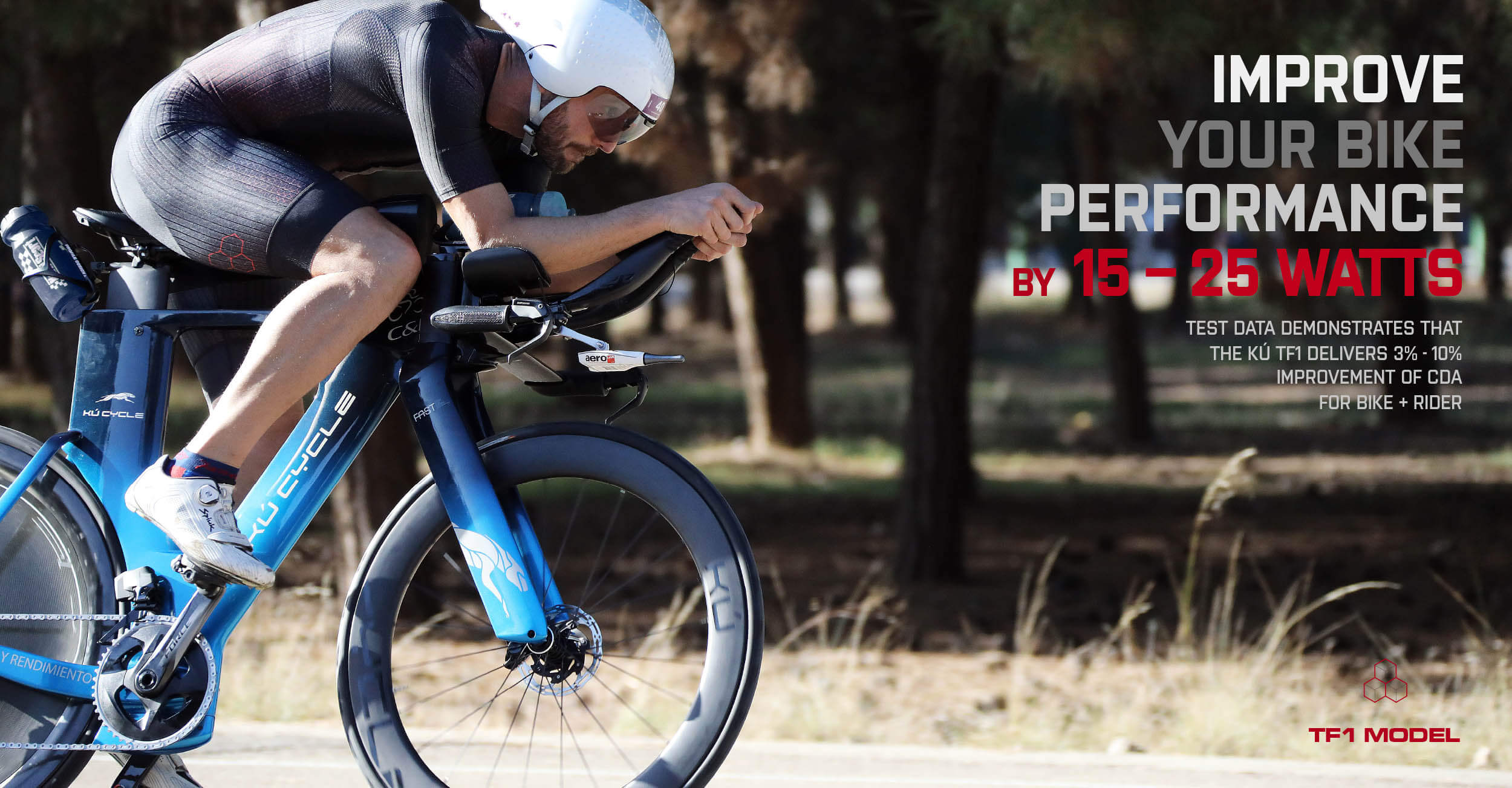
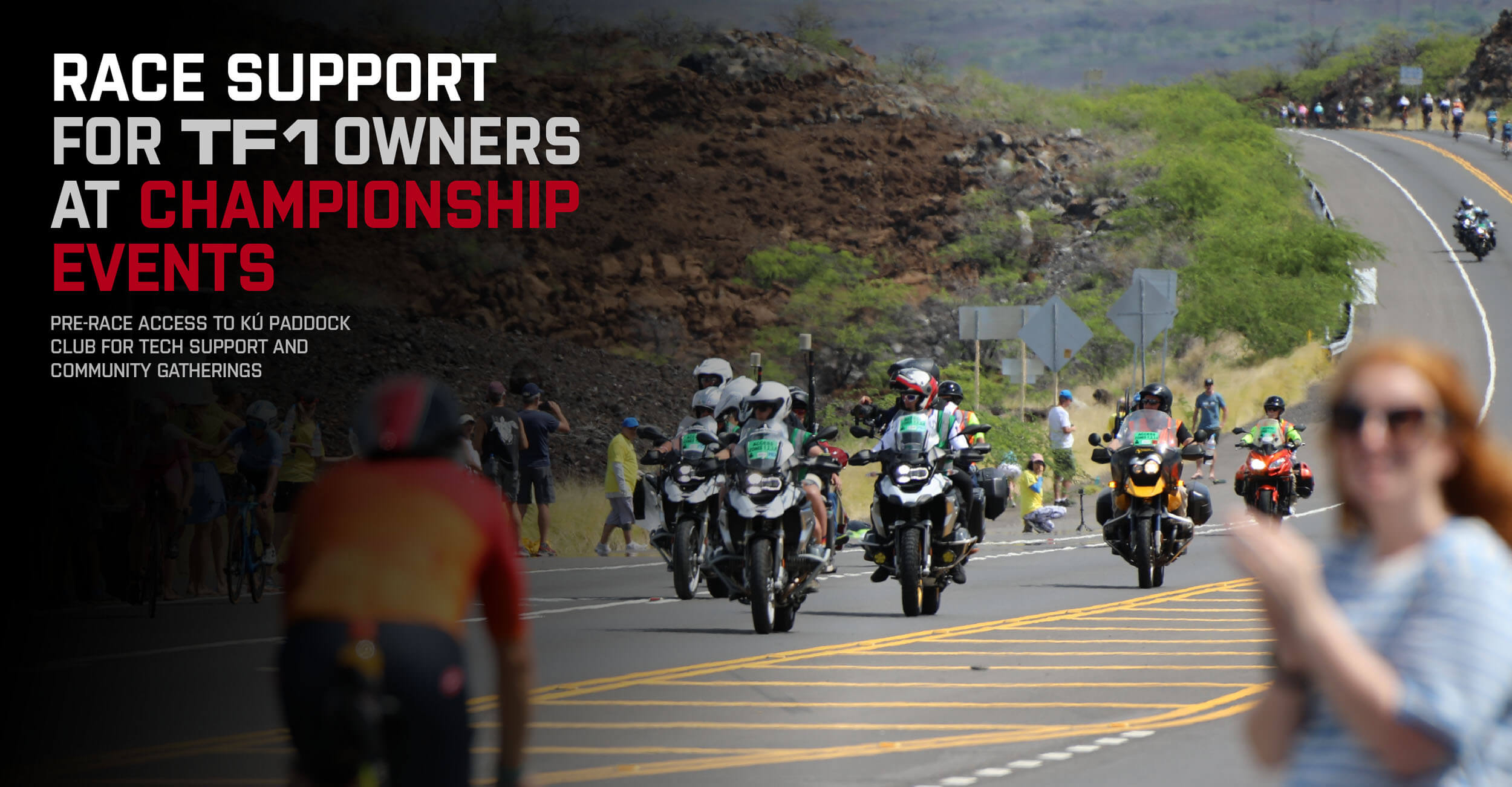
Design and photography share the same eye. The product photography, the event coverage, and the editorial imagery for Kú Cycle all came from the studio that designed the brand.
Most of the images on the Kú Cycle website, marketing material, and ad campaigns are original studio work — including every gallery in the online store.


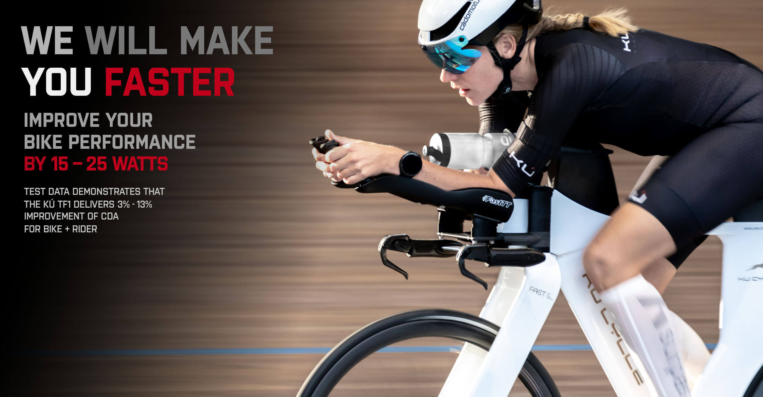


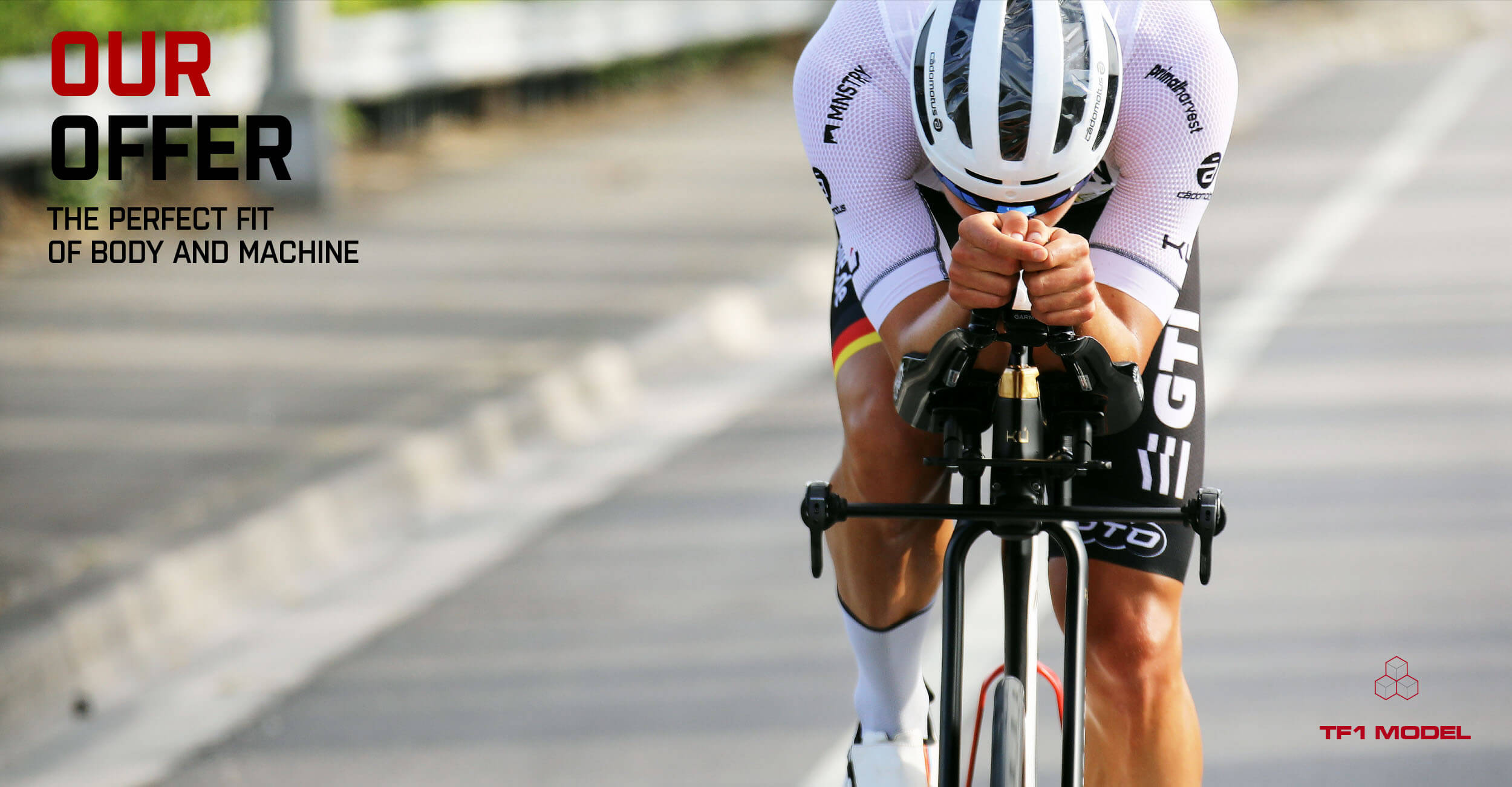
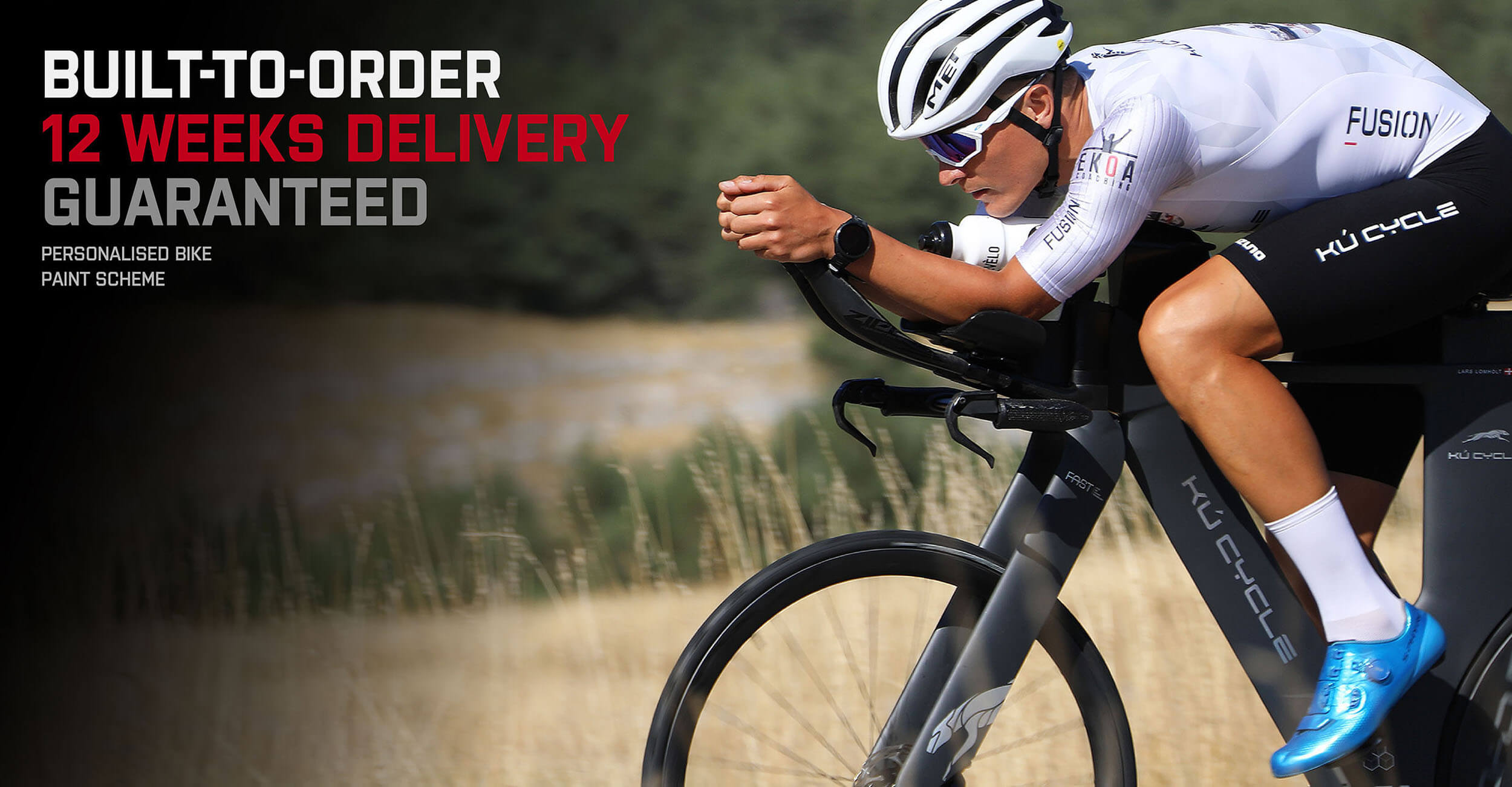


| World Championships | Years |
|---|---|
| Ironman World ChampionshipKona, Hawaii | Oct 2022 |
| Lars Lomholt — Age Group World ChampionNice, France · Kú Cycle athlete | Sep 2023 |
| Ironman World ChampionshipNice, France · Monaco | Sep 2023 |
| Ironman 70.3 World ChampionshipLahti, Finland | Aug 2023 |
| Ironman 70.3 World ChampionshipMarbella, Spain | Sep 2025 |
| Ironman & Challenge Circuits | Years |
|---|---|
| Ironman 70.3 WestfrieslandHoorn, Netherlands | 2021/2022 2023/2025 |
| Ironman MaastrichtNetherlands | Aug 2022 |
| Challenge Almere — Europe Long DistanceNetherlands | 2024/2025 |
| T100 Tour MiamiMiami, USA | Mar 2024 |
| Challenge Vieux BoucauFrance | Oct 2023 |
| Ironman 70.3 ValenciaSpain | Apr 2026 |
| Aero Tests & Special Events | Years |
|---|---|
| Kú Aero Tests — Alkmaar VelodromeNetherlands · 10+ sessions | 2024/2025/2026 |
| Kú Aero Tests — Apeldoorn & AlmereNetherlands · 8+ sessions | 2022/2023 |
| Kú Aerotest ValenciaValencia, Spain | Nov 2021 |
| Maarten vd Weijden Frisian TourNetherlands · 11 cities | 2021/2023 |
| Almere Dyke PhotoshootAlmere, Netherlands | Jul 2020 |
| Velodrome Sportforum Kaarst-BüttgenKaarst, Germany · Shakedown test | 2019 |
One visual language,
two distinct expressions
The Kú identity system grew to support a two-brand architecture: Kú Cycle, the product company, and Kú Racing, the competitive team. Each has its own brand book and emotional register — while sharing the structural DNA of the greyhound mark.
Bike paint scheme, competition suit design, and sponsor logo integration — the bike and the athlete look like one thing on the start line.
Athlete performance
delivered
Black, white, and structural red. Technical, precise, and confident — reflecting the F1 engineering background that produced the bike. The language of performance without cliché.
Where passion meets
performance
Gold and dark, with red stepping forward as the colour of passion — a warmer, more aspirational register that speaks to the athlete community and sponsorship ecosystem. Same greyhound, a different fire.
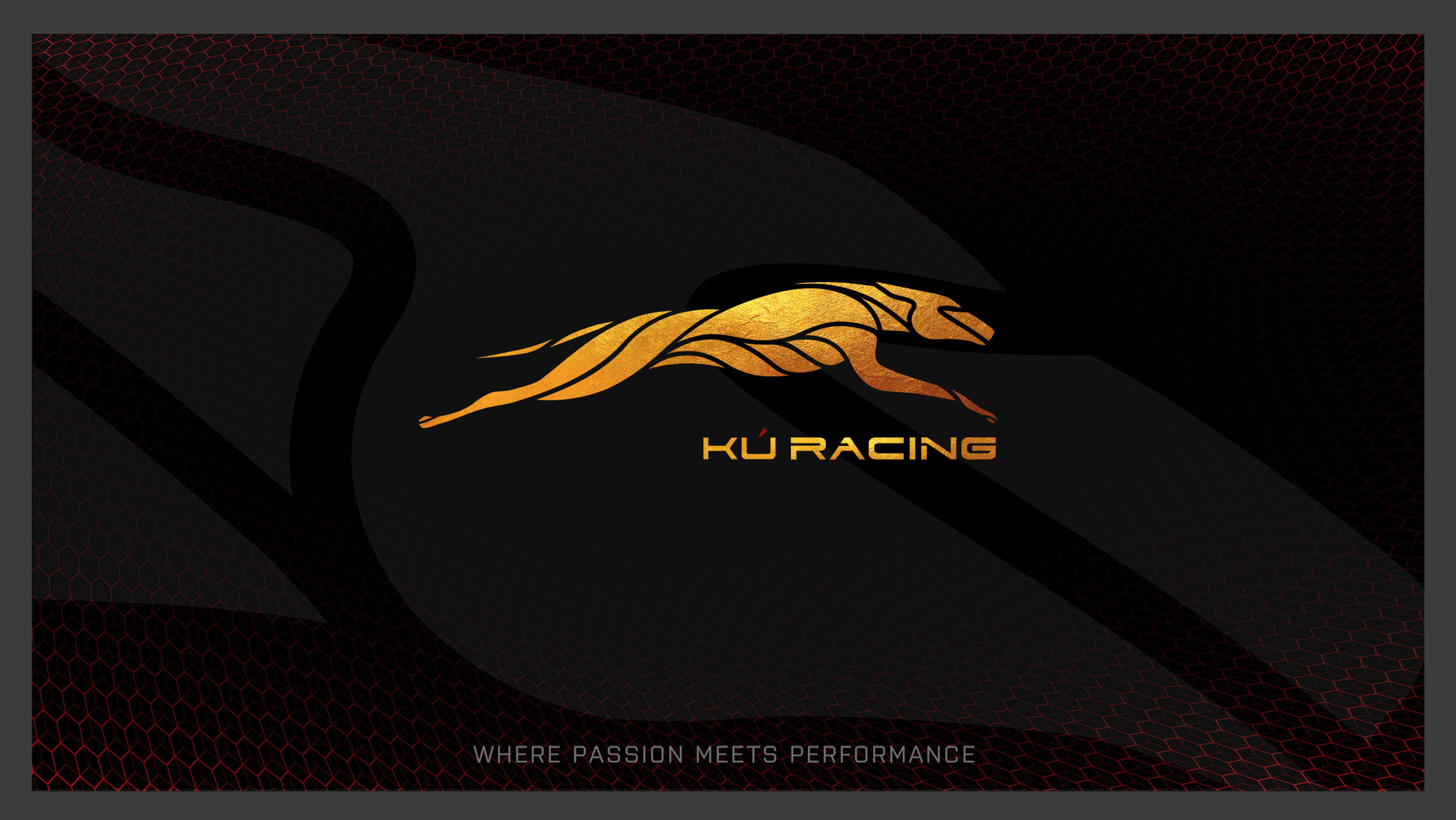


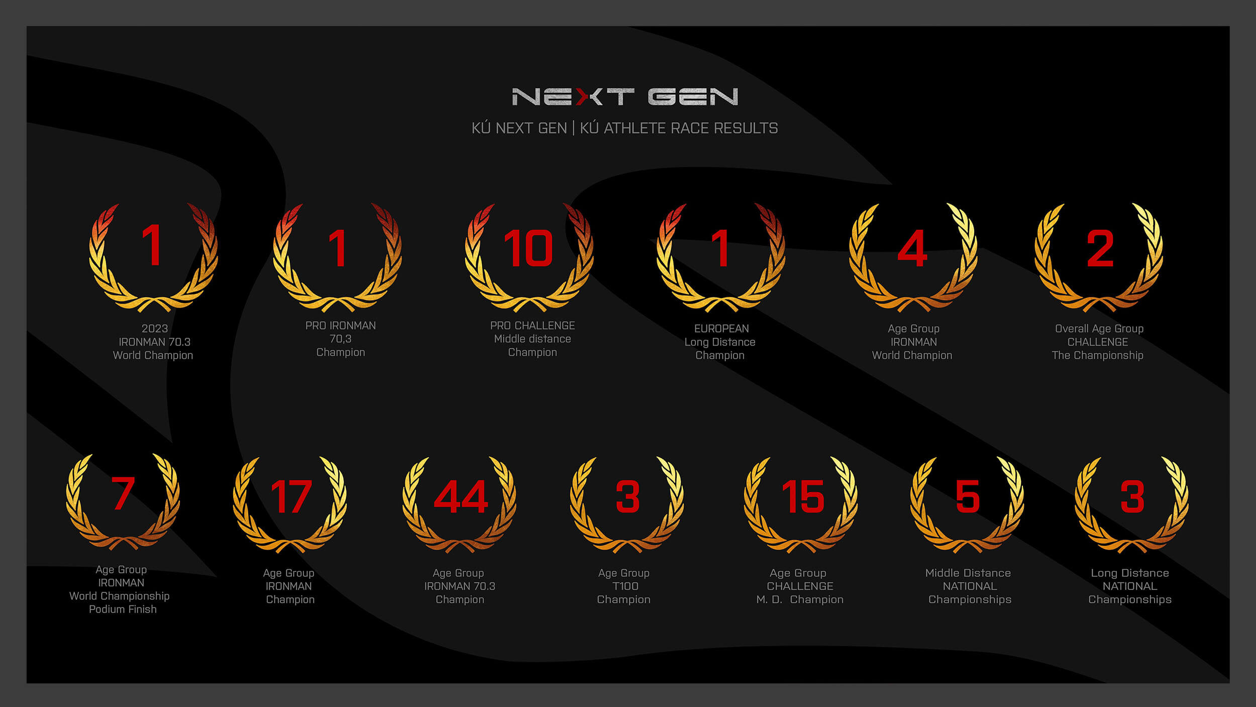
Kú Racing 2026 — brand identity
The argument for a single
creative intelligence
One studio holds the identity, the platform, the photography, the customer system, and the documents. Consistency is structural and self-sustaining. Seven years of creative decisions made by the same hand, all pointing the same way — that accumulation is the value.
Every new application tested against the system. One creative intelligence, applied consistently, with full continuity from brief to execution.
89-page website, store (88 products), 91 NextGen + 7 Kú Racing profiles. Server management, security, debugging.
Race coverage across 5 countries, product studio, 88 store products, user manual. 4,000+ photos published across 44 galleries.
CPO design and production for every single bike — 500 built across 42 nationalities, 1,500+ samples presented. From brief to paint shop.
Each new innovation named, marked, and integrated into the system — FAST, HAS, SPB and beyond.
29 blog posts, social campaigns, video processing, presentations — all produced in-system.

TF1 Model — product page